Real graphs do not follow the idealized graphs, however. They have various ups and down, minor peaks and valleys. Combining these with a relatively broad, flat expanse at the top, real graphs of resource usage look more like mesas than peaks. If you look at a graph of world oil production, it looks like we entered the flat stage around the year 2000.
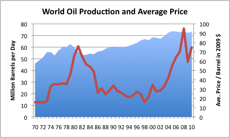 |
| From World Oil Production - Looking for Clues as to What may be Ahead |
Why this is important is because this allows petroholics to adjust to a stable oil supply. Consequently they are in denial about the coming declines. When the declines do come, especially the first few, they can be attributed to extraordinary circumstances, like a war, an uprising, or a natural disaster in a major oil exporting nation, like the Iranian revolution in 1979. People come to expect that things will "get back to normal" afterwards -- and for the first couple times, they may be right. And as the graph shows, the period from 1989 to 1993 was also relatively flat, due in large part to the collapse of the Soviet Union. We can't be sure that we have truly past the peak until long after it happens. But sooner or later the oil supply will finally dramatically and irreversibly drop off. When it does, the majority of petroholics will have no clue what is happening and will be bewildered.
For those who are making the Long Ascent, however, it will be a welcome return to what has truly been normal for most of humanity for most of history.
No comments:
Post a Comment